ReTypography Series — Taiwan's National Identity Crisis and Graphic Design
Taiwanese are not unanimous when it comes to the national identity. Different groups of people have strong but conflicting standpoints regarding this identity issue, while most people in Taiwan refuse to give a clear answer on questions such as “Who we are?” or “Should we be called Republic of China or Taiwan?”, and many people have never even thought about this question at all. For visual designers who strive to showcase a country’s spirit, the discord presents a tough challenge.
To graphic designers, working for a client with no sense of identity and principles is a nightmare. Faced with this issue, designers will probably only have three options. First, is to decline the case instantly, avoiding any possible trouble. Secondly, ask the client to establish their identity and principles. If they did, designers might give it a shot; if not, besides from giving it up, the third choice is to come up with designer’s own interpretation or imagination of this client, and finish the case.
Unfortunately, Taiwan is this type of nation/client. n such circumstance, no one expects our government to present a clear identity, and most designers choose to stay away from cases related to the public service. A lot of designers opt for the third choice, which seems unwise, but it is the only way they can contribute and make impacts.
Many great designers in Taiwan have shown amazing redesign works or ideas of the national ID card, passport, stamp, flag and bills, featuring the designer’s own interpretation of Taiwan’s symbolic image. But for people with different political beliefs, cultures or ethnics, these symbols have barely acquired their collective appreciation - because there hardly exists any symbolic image that these groups all agree on.
What, indeed, is the correct symbol or element to use to gain most recognition, and being able to clarify our confused identity?

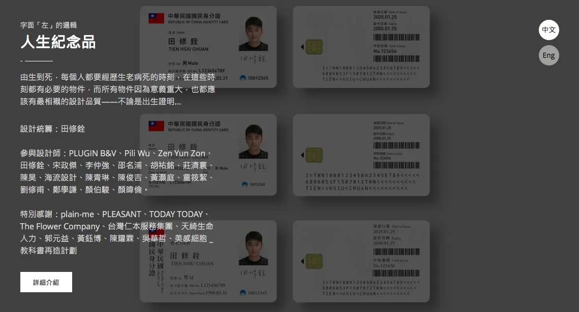
This complicated problem came to me months ago when I was assisting designer Neil Tien’s “Souvenirs of Life” project. The project was about redesigning objects of significant life moments, including birth certificate, ID card, wedding booklet and the white envelope representing death.
I was assigned to redesign the ID card and driver license within a month. Faced with the two items related to our national identity, I was mortified because I know how much work needs to go into the preparation — including research, interview and organization — to complete this mission. Of course I could come up with something beautiful on my own, but I didn’t want that. After all, another controversy made over the identity symbols issue and work with no impact is unnecessary. So, I decided to complete this task by avoiding the question “What patterns can symbolize Taiwan?”, but rather focused on the most basic structures of these two items.
Typography.
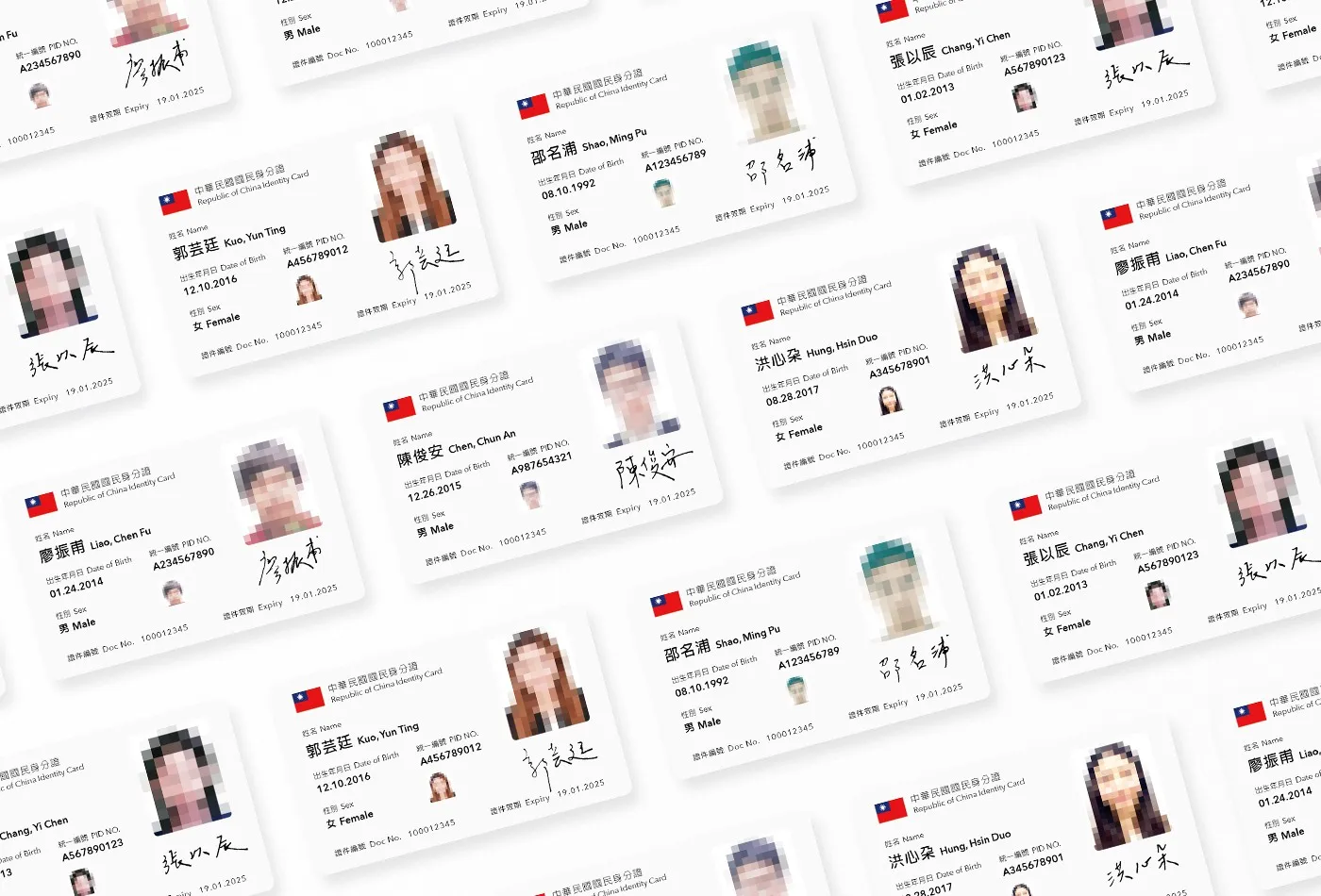
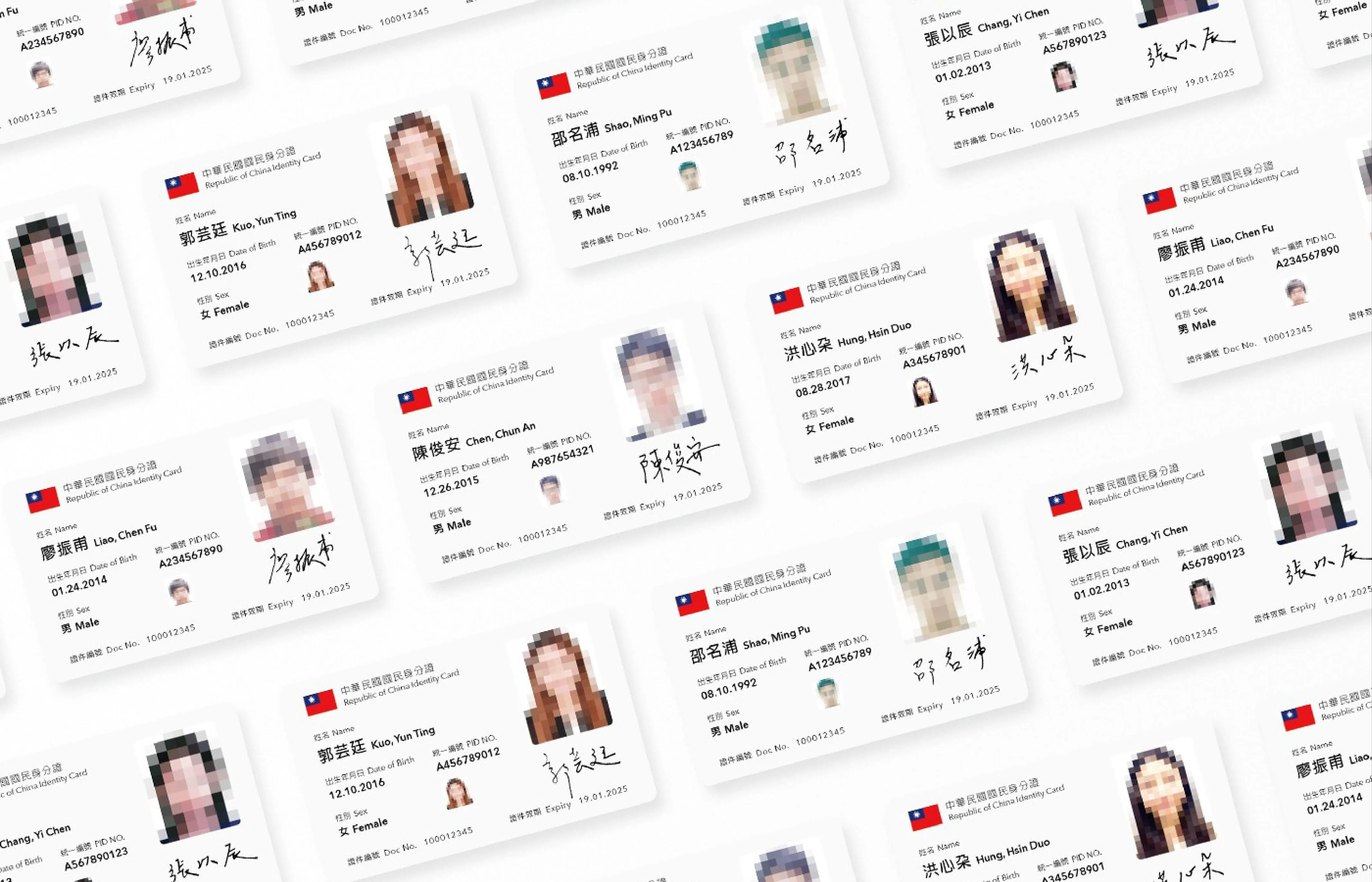
Typography is the most elementary yet crucial and difficult part of graphic design. It can affect the sales of a product, an election’s outcome, and even life. For objects like the national identification card, driver’s license or tickets produced by the public sector, the role of typography should gain more attention from the government, designer and people.
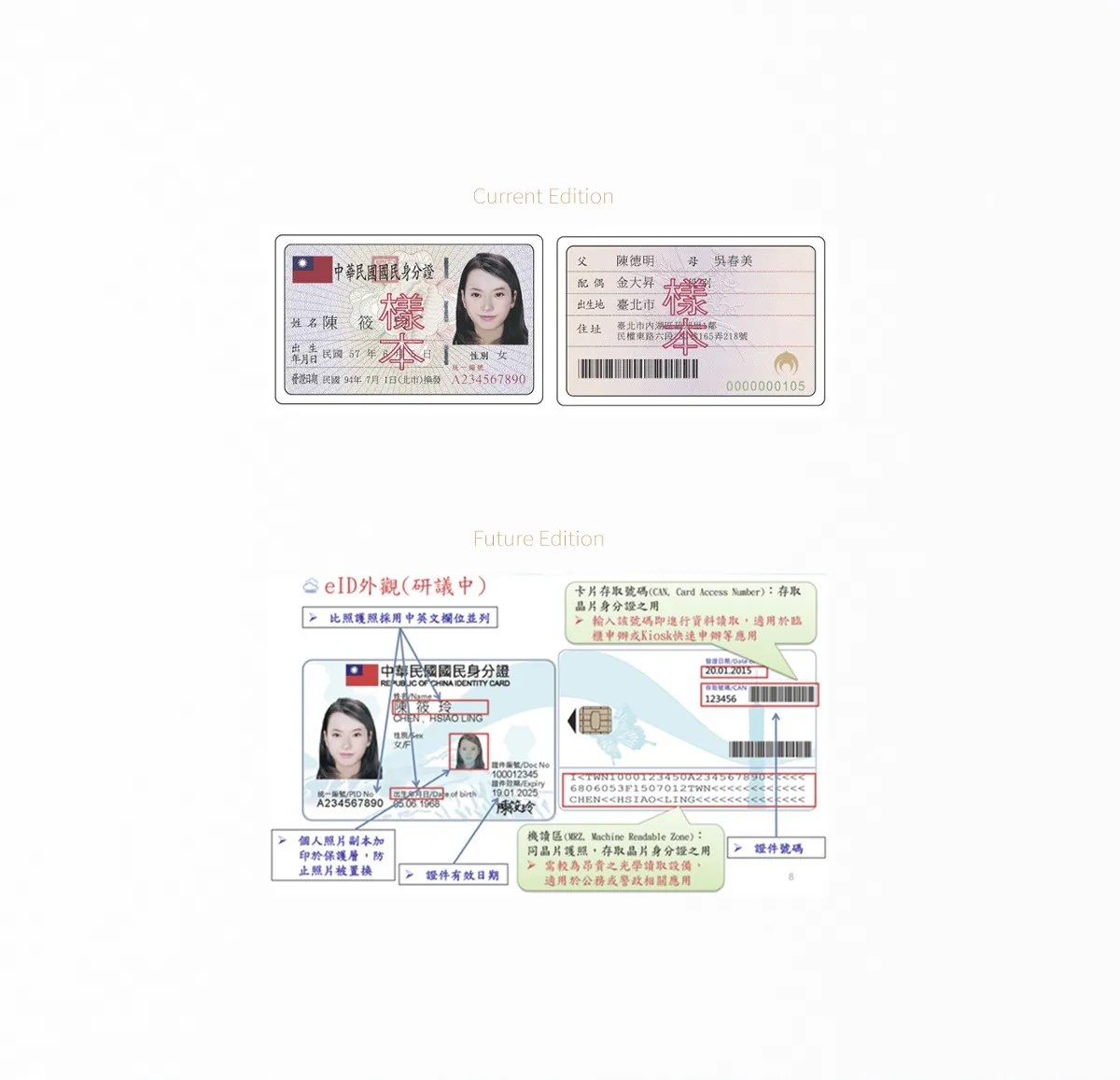
For example, typography on the current(and assessing) national ID card and driver’s license is a total chaos. Everything from typefaces, font-sizes, line-heights, tracking and margins are set without principles; it even deforms the font’s proportion of the person’s name. Before the fight about who or what is qualified to put on these objects to represent all Taiwanese people, I think we really need to pay a serious attention to the typography chaos.
For me, typography not only lays the foundation for graphic design, but also represents the designer’s basic respect to the work and its user. From these cards’ typography, which violently deforms names, birthdates or sexes of the users, I don’t see any respect to people’s identity at all.
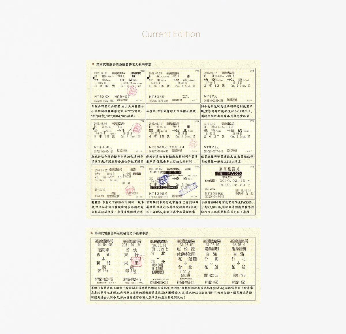
Faced with an amount of information, a well-designed graphic work must show its willingness to accommodate diversity instead of eliminating differences. But what an unqualified designer would do is to ignore disparities — which could be names longer than the regular three-word length on ID card, addresses longer than 30 words on driver’s license, or additional information on train tickets — and creates a layout that only suit the majorities. The result is a tyranny of the majority layout, which violently and disrespectfully forces minorities to change.
A good designer who cares about every user would take time to review every possible variation of the content meticulously, and then design a proper grid system with decent typesettings to accommodate all distinctions. That attentiveness to detail is essential to do great designs, which could provide comfortable user experience with legible paragraphs, readable sign system or fluid responsive web. In the case of an ID card design, this attentiveness could allow the government to provide people with a sense of belonging and assurance of respect to every individual.
Typography is important. To scrutinize graphic designs from the public sector is not about asking for a clear definition of Taiwan’s national identity or picking up fights, but demanding our government to take this problem seriously. Before people in Taiwan can find our national identity, satisfying typography from the government can at least unite us with respect to every race, sincerity to citizens, and promise of improvement.
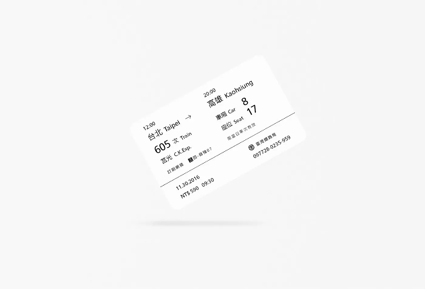
Inspired by “Souvenirs of Life”, I organized my thoughts and designs of ID card, driver’s license and train ticket altogether, naming these series of works as “ReTypography”. Instead of the phrase “redesign” commonly used, I called it “ReTypography” because it only focused on the typography of design. Focusing on typography means two things. First, I didn’t take any element other than typesettings into consideration. No guilloche pattern design, no logo redesign, and no branding concern. Second, the contents and information on the original versions were basically all reserved, only some redundant ones were rearranged or deleted.
I’m not a typography specialist or graphic design expert, publishing these words and works needs extra courage and cautiousness. But I decided to do it anyway. “ReTypography” series does not providing a correct answer to all questions I’ve mentioned above, it’s just my own way to try make this nation better. Of course graphic designs wouldn’t impact people’s life like architecture design or industrial design, but sometimes it is the invisible things that matter most, and typography as the fundamental part of graphic design matters even more. I hope “ReTypography” can gather extra attention to things that are simple yet crucial — simple things that need our effort to do it right. And this is what I, as a graphic designer, can do to help Taiwanese people be united and find our identity.